

When did logos become so basic? Long live maximalism!
They don't make 'em like they used to.
Poolside flex

If you’re looking for rotation, these are the type of mainstay kicks that work whether you’re dressing it up or going casual. Check ‘em out.
I’ve been thinking
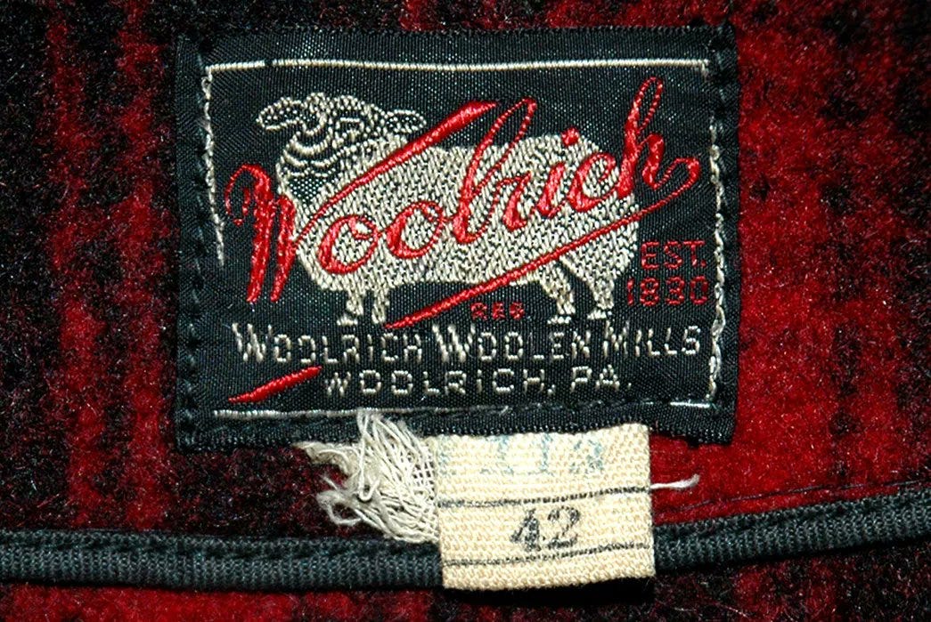
Last week, I dropped a collection of vintage sportswear (which you can find here if you’re interested) pieces in the newsletter, and it reminded me how good the design on clothing tags used to look.
There was always something fun to look at, a nice saying, a drawing of someone or something, and at least 2-3 colors for depth.
Here are a few examples from the pieces we dropped last week to reference…


See what I mean?
So, I went down the rabbit hole and found some other tags from classic American brands, and I remember that maximalism on clothing tags was the standard.
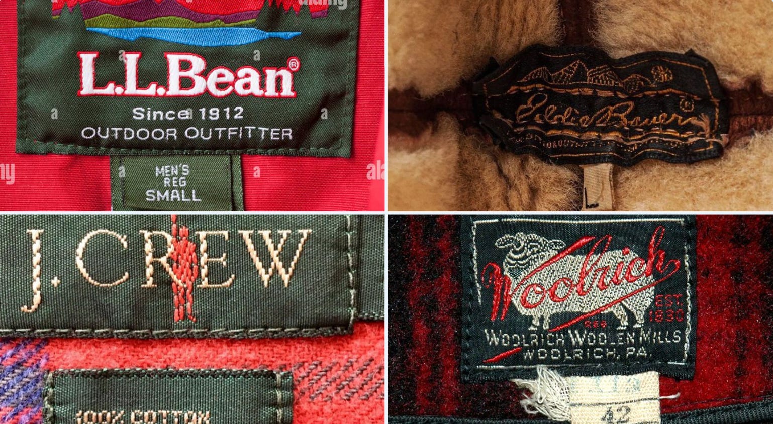
The detail is clear, there’s a narrative and story behind each one, and it makes the product feel timeless. Because it was.
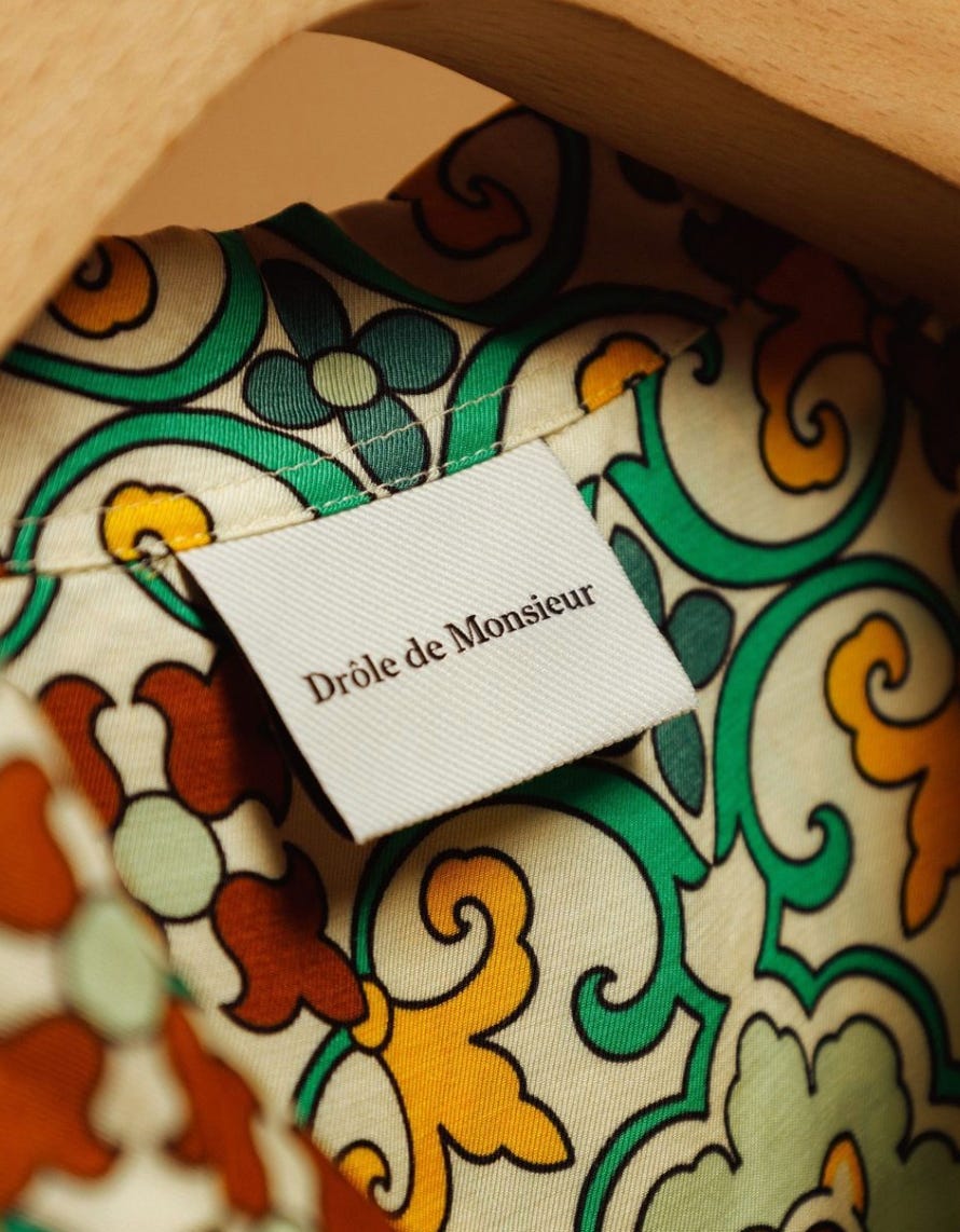
But it’s not just about clothing tags; it’s literally about logos too.
This isn’t a knock on other brands, but clothing tags feel so bare and minimal these days. Just plain black text on a white tag.
Copy. Paste.

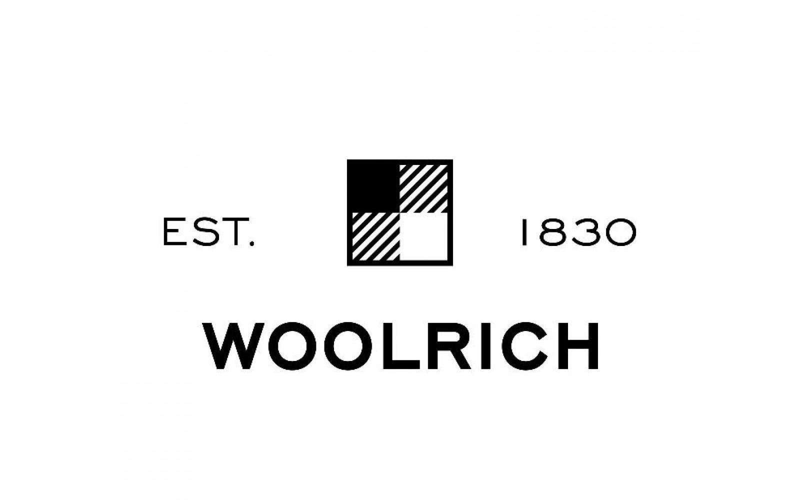
In 2019, Woolrich even introduced a new logo for the now 193-year-old brand.
Compare that with this.
WTF is going on!
Where have all the good clothing tags and logos gone?
Yep. I’m sure it’s about minimalism, mass production of goods, clean lines, saving money on production costs. All the above.
But I don’t want that. Give me color! Chaos! Corny sayings! Long live maximalism!
This was supposed to be an homage to how clothing tags used to be designed.
But it’s also a nod to the brands reinjecting narrative into their products, bringing back the richness of design we love.


Any other brands that make fantastic tags these days? Hit me with some names in the comments.
The trend for minimalism came with the dawn of mobile devices, and then only recently are we seeing a shift from the stale sans-serif typeface / ultra modern look back to maximalism. You’re right. having a “cluttered” logo paints a richer story, especially for a brand that’s just beginning.
Engaging a minimalist aesthetic only works for certain types of brands most of the time (think active wear) but luxury, streetwear and startup clothing brands would benefit more for something a little bit more noisy, colorful and in your face.
Minimalsm had its day in the sun, it’s now time to explore and have more fun! Inject more personality! \
A friend of mine noticed that, as brands started to get more interesting with their design, their logos got more homogeneous and boring. Now, brands are starting to experiment with cool logos... right as bland luxury is gaining steam. Loro Piana's text logo right now is more unique than Gucci's, but Gucci is starting to experiment with not having a designer, so I expect them to have a cool logo soon.